Wednesday, May 6, 2015
Sunday, June 16, 2013
Lots of Contests and Shows Make for a Great Year


The last year has been full of contests and shows. "The Queen" was in the Texas State
Fair last year and came in 3rd for watercolor portraits. The "Gypsy" won Best in Show at the
Dallas Public Library contest, and the "Flamenco Dancer" came in 3rd. However, I found out from the librarians that
the one that received the most attention was the "belly Dancer". Soon after I had a 45 day show at the library
in Oaklawn. In it, I put in "The
Frogs", "School of Koi
Saturday, November 26, 2011
New Phases in An Artists Life


The phases consist of areas of concentration that an artist is focusing on. This year I've had two: Movie posters and horse paintings. Both of them are fun and rewarding, and allow me to really grow. The theory goes that in order to excel at a certain genre, you have to paint that particular subject three times. The other is that it requires 10,000 hours to excel. Hey, I'll go with the three paintings. Who has 10,000 hours to do anything?
MOVIE POSTERS
The first one is the movie posters. I started by doing existing movies posters, like the Good The Bad and the Ugly on a two foot by three foot sheet. I searched around on Google images to find the poster that jumped out at me. Believe me, you will know the one that speaks to you when you see it. It has to be an image you want to spend at least 12 hours with, and although I don't like the movie (way to slow and too little dialog), I could look at these guys all day. I also learned pitfalls with going for large subjects. Keep this in mind: you will not have a way to stretch it on a backing. So you want to pick focal points that won't take forever, and a background that you can speed through in order to NOT waterlog your paper. All these are watercolors. If you waterlog a huge piece of paper, your whole thing will be warped and not look good even pinned down by the mat. You may also have limited acccess to an area. I had to do Van Cleef standing up to reach his part of the paper because he was so high up. Here's another trick, use Indian ink for your background. I found that it covers it usually in one application and doesn't warp much. Remember, without a backing, you only have so many times to hit it with the wet brush before the paper goes all accordian on you. Black ink makes that foreground really pop. Cool 3-D effect. I started off masking any area that was going to stay perfectly white, especially the highlights on the hats and the whites of the eyes. Doing three faces back to back, I figured out that you want to go as far as you can with the burnt sienna (reddish brown) as a complete portrait. Then add burnt unber (dark brown) as far as you can go, then erase using the magic eraser where you haven't left enough lightness or white for the highlights, then go back and with the burnt sienna and burnt umber. You don't do the black ink until everything else is done.
I made a boo boo by not leaving a highlight on Van Cleef's hat, which made it look different from the other two (to me anyway.) I taped off the edge with masking tape where I wanted the highlight to show up. Then I scrubbed it with a damp magic eraser. This is the greatest invention ever for a watercolorist, who used to be cursed to live with screw-ups like that for the life of the painting, since I we had was a little lightening of the color with a paper towel. Now we have the best of both worlds, even with staining colors like green! The movie poster "of Human Bondage" was an orginal I made up from a photo of one of the movie scenes. This is even more fun than doing an existing poster, because you get to make it look any way you want. Next I could do favorite book jackets. Whatever grabs me at the moment.
THE HORSE PHASE
The second phase was painting horses. Horses make incredible subjects but require TONS of detail work. This is something you can really get OCD with if you don't finally say "Good enough!" But they really come out looking just like the photograph if you dedicate a good bit of time. Here's what I do: I tape off the horse and rider. This frees me up to get nice and loose on the background. Then I would tape off a fence. What if the photo doesn't have a fence? Well, I find a fence a pretty way to do a background and just about the easiest. Just three strands of tape across the canvass and your have a fence! Do this AFTER you have taped off the horse and rider. It will be your middle ground.
Now you can go a little wild. Lots of great sky, trees in the background, a nice grassy lawn (remember, these are people with money for horses and landscaping) of course your fence needs some pretty shrubs and bushes behind it. Throw in some color. Not overly detailed, though. Your horse and rider are the focal point. Nothing should take the eye away from them at all. So leave out the details and dark shadows. This should take an hour or less. Do not leave the background until it can stand on it's own as a nice fuzzy landscape picture on it's own. Once the tape comes off, you cannot go back to it! If you find you must go back, retape at least the fence. That fence is left white.
Now we move on to the horse and rider once you remove the fence tape. Again, you're going to hang out with these two for about three days, so find a subject you LOVE to look at and won't get tired of. I guess with the horse thing, it's like an alter life I might have had if I could have handled being on a fast horse, and had the money for boarding, food, a horse, and lessons. That didn't happen, so I will do the vicarious thing. I don't doubt I'm a much better painter than I ever would have been a horsewoman.
With the horse, again, start out with the lighter color (either burnt sienna or burnt umber) put down a wash, dab off the highlights, and then add layers upon layers of darker paint. Lift as you go with paper towel if necessary. Then go with the darker color and go as far as you can with that. Then you want almost black. Mix a burnt umber and blue the shade of your sky to get a "black." I do not use Payne's grey. It's kind of a dead color. I do for the top hat and things like that, but that's all. See that tent in the background? Purely taped off. No paint on that except the stripes. Then I went with a double mat of the same white and black. I hadn't paid for framing in some years, but this one was really an exception. Here's my plug for Hobby Lobby: If you buy the frame and have them cut a mat there (you'll have to for these jumbo paintings), Hobby Lobby will frame it for you while you are in the store!
The neat thing is I've been commissioned to do a couple of paintings of family members. This will always be a hobby of course, but it's nice to actually have people think that I'm good enough to paint their family and friends. These frogs are not part of the two phases, but they did win in a rescent art who, and they COULD be a movie poster, don't you think?
Labels:
artist,
Horse art,
Melody Stanford,
movie poster art,
watercolor
Monday, October 4, 2010
Showing Off Your Hobby in Public
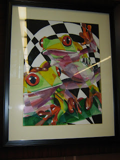
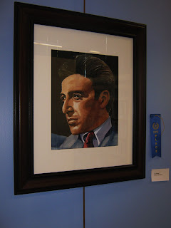
What I do is look for opportunities to practice my hobbies in public. Not in the classroom, not in front of my teacher, but in front of a real audience. There's lots of ways to go about this: enter contests, find a captive audience who will clap politely, or video whatever you are doing. Just knowing that it's being video will have the same effect. What's the point of doing it in public? To up your game. There is nothing to get your adrenalin involved like being in front of people for the newbie.
You'd think that I'd have gotten over my stage fright by now but that's not the case. This week I played a small concert on the guitar for my watercolor class. I did the same thing in front of my dad and one of his housemates at his assisted living facility. Being perfect at my level is not a realistic possibility, and these groups don't expect it. They just want to support you. Even though I knew everybody, I still had a pretty good case of butterflies going. And of course I had more fun than anybody else there. Once you've broken the ice and played in front of a "safe" crowd, your confidence is up and you can work toward playing in front of a lesser "known" crowd. Hey, we could play at a Borders or something. It's all about just getting in the water to learn how to swim. If you don't get in the water, you'll never swim.
I also entered an art contest this week. I didn't know whether the woven painting or the portrait would win. Most people thought the frogs were the slam dunk, but I wasn't 100% sold. I thought Al Pacino might win over adorability. He IS pretty adorable, too. And he won. So what does this accomplish? Did I get any money? No, I got a ribbon I don't get to keep. And I paid $30 to enter the two pieces (and join the Friends of the Dallas Public Library). But it upped my game! Now I'll enter more contests. AND I have another show scheduled in the spring for all my new portraits and woven paintings that I've been cranking out. Thanks to the Dallas Public Library.
How do you up your game with reading? Books on tape! I'm almost done listening to Jane Eyre at the office (I have one of those jobs that I can do while listening to books and watching the daddycam at my dad's house), I'm listening to The Unauthorized Biography of J. Edgar Hoover in the car, and on the train and at lunch and on the elliptical or in bed I read What Happy People Know or a Thomas Wolfe. So basically, this week I've upped my reading by doing it in public.
Why would you want to up your game? There's lots of reasons to do a hobby, but improving your skill is part of the deal. Plus, if you don't challenge yourself, it's not nearly as fun. There's lots of ways to keep your brain active, and learning a new skill (a new song, a new painting technique, a new exercise) is about the best. Watching TV is about the fastest way to turn your brain to mush. Think about it. We are all born with that particular skill mastered.
Sunday, August 29, 2010
Woven Paintings: Create a Special Painting from Two So-So Ones
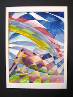
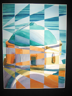
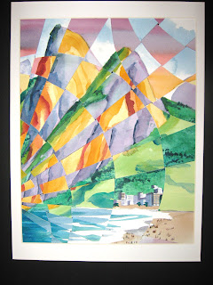
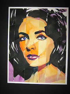
We had a demo last year in my watercolor class that basically rocked my painting world. I always like to develop new watercolor techniques that are easy and turn out consistently good results. Weaving two paintings together is about as easy as it gets.
First you paint two separate paintings of the same subject. Landscapes probably turn out the best. Portraits are a bit difficult and, although Liz Taylor is recognizable, I have to deviate from her true skin tone in order to get any variance in the paintings. In the above I used orange, so it might come out just Liz with splotches of orange around the mouth. I don't think too many people at the office who saw it even realized it was a woven painting. I could have gone WAY off the natural skin tone, but then she wouldn't look like a person. Or green. Or blue. Skin tone on the first painting and orange and gold on the second just says bad skin.
OK, so let's say you are going to pick a landscape, a seascape, an unusually shaped structure, aspen trees, or an animal. You do two exact pictures by tracing. I personally go one light, one significantly darker; one pastel, and one more primary. Opposite colors on the color wheel work great. I tend to stay away from browns and a whole lot of realism for the colors. However you do your painting, it will come off abstract in the end due to the weaving. I would say the less complicated your subject, the more recognizable it is. The building in Santorini above is a good, basic building with the shadows on both paintings in the same place. Most areas can be lined up on a simple subject. If you do mountains with varying shaded areas, the tops of the mountains can be lined up, but not the shading. Some people don't mind things being out of alignment, but it just depends on how recognizable you'd like your subject to be.
Once I have done the paintings I start on the cutting. This is also arbitrary. The most common is one vertical and one horizontal. I think that's a bit boring, and tend to go with circular lines on one and diagonal lines on the other. Even if you like straight lines, diagonal is far more interesting. Curves add movement to the picture making it almost swirly. Curved lines can be drawn with a big bowl. I draw the lines on the back of the picture, and if there are details on one painting I want to retain in the finished painting (e.g. a cool cloud formation or in Liz's case the eyes in one were better than the other) I draw the lines on the front of the painting around that area and build the cuts around that one strip.
Finally you cut it based on my little video, and just weave the strips together ony by one. It might take a good while to get everything to line up. I sometimes start over. The best way to avoid getting things out of order is to number the back of the strips.
What comes out in the final product is a big surprise, especially to me! I have NO idea what the weaving will look like. But so far, I've been more pleased with the woven painting than I was with the original works. I guess it's because it really is an accident and it's SO easy to make it all come together.
Subscribe to:
Comments (Atom)

